typography CRIME
- Natalia Gasior

- May 3, 2018
- 1 min read
Updated: May 13, 2018

Bonie Siegler, New York-based graphic designer once said that our choice of typeface is as important as what we do with it. Even brilliant article or funny slogan can become a disaster because of the chosen font style. Text can be a liiiitle big too big/small or too bold or too curvy... kerning can be set up wrong and ! This list of things that can go wrong with your type choices could go on and on, and on top of that graphic designers not always come to a rescue.
Before I really started to get into a typography and had tutorials about it - I hadn't been noticing these small things on adverts, notes, signs etc. that not are very annoying for me. My tutor from Bucks uni once told me that when some designs and typography around you become annoying and you start noticicinh things you haven't before - it is good, it means you are becoming a graphic designer ;)
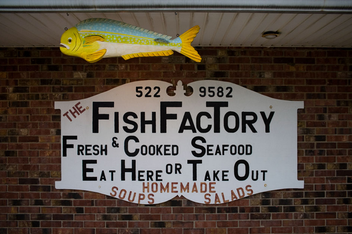
Here are some photographs of typography crime:


I hope you enjoyed my post and have never committed any typography crime, at least not any big one! ;)


Comments